Today is Logo Day in Japan. The date was chosen as a pun formed by the first syllable of roku (ro/lo), Japanese for “six” and go, Japanese for “five”. The purpose of the day is to promote effective logo design. In Japan, it’s still not uncommon to find not only the make logo on every car, but a unique model-specific logo as well. As a result there’s no shortage of cool badges to be found.
What’s your favorite Japanese car logo?
The most entertaining comment by next Monday will receive a prize. Scroll down to see the winner of last week’s QotW, “Would you import a JDM car that you could get in America?“.
We enjoyed the comments this week because thye proved that our JDMness scale wasn’t foolproof. ceuppens eric reminded us that a car that might be a JDM2 in the US could be a JDM3 in another country. It all depends what was officially sold on your home turf. Ian G. described perfectly my personal philosophy, which is that the car would have to be sufficiently different from its US counterpart, a JDM2 or higher. As Bryan Kitsune mentioned, the novelty of a RHD car will wear off pretty quick if you have to make a lot of left turns while craning your neck to peek around giant SUVs. While I personally wouln’t make the RHD sacrifice unless the car was significantly different, Fred Langille is correct that driving RHD isn’t hard, even if it’s a stick. You quickly get used to it.
On the other hand, Land Ark pointed out the fact that similar cars will have more parts availability, an important factor to consider if you can’t afford to have your RHD ride stranded as you wait for a piece to make its way across the Pacific. In the same vein the winner this week, Sammy B, reminded me that I’m spoiled here in California, and that in some more rust-prone parts of the country a 90s car is all but extinct. In that case, it makes total sense to import a 25-year-or-older car even if a close equivalent was sold here.
Living in Ohio, anything from the 90s or older is scarce….and that’s even before considering the high likelihood of a ton of miles and rust. Ideally I’d be interested in something *similar* to what we could get in the US, but not quite the same (e.g., XV20 Camry wagon or a 1st gen TSX wagon, or a Townace similar to the 84-89 Toyota Van). Ideally one that may even use the same engine as we got USDM just for some convenience. But even finding a nice MR2 may require importing.
I’d love something really cool that we never got here, but I also know my budget & knowledge limits to keep something like that viable.
Omedetou, your comment has earned you a set of decals from the JNC Shop!



There were Bluebird Logos and Crowns. I would go with the Nissan Stagea Logo the double unicorn. It shows how rare those cars are and the two faces of the Stagea.
Review of logo designs can be a long dark rabbit hole to climb out of. Personally I like how Honda designed the Acura and Honda logos to be mirrors of each other. If you flip the Honda H and squeeze its ends you get what looks like an A and a caliber. Fantastic design. I also like the Mazda wing logo which not only looks like wings but as many owners have done can be clipped to looked like a batman M. My least favorite logo is the Toyota cattle brand. The fact I called it a cattle brand says it all.
oh wow. I’m honored to win QotW! Thanks
My favorite logo is definitely not going to win this week, but I love it: the large “TOYOTA” across the tailgate of 80s-90s pickups. I know it probably doesn’t get a lot of style points, but I think it’s just perfect (and iconic)
I oddly like those block letters too. I also love the thin outline SUPRA across the hatch on some of the A60s. Automotive fonts can be very interesting.
I’m gonna have to be on brand for me, and go with the Celica dragon. Because Celica, and because dragons.
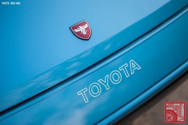
I love it when a cool niche car model has its own logo just like the cover of this article. Also being a fan of both MR2’s and the Philadelphia Eagles I love that MR2 eagle badge.
I didnt not like that the 2nd Gen/MKII MR2 didn’t get its own logo and shared the Toyota sombrero with all the other Toyotas. So my submission answer is the MKIII/MRS Eagle badge. The JDM one. I loved that it was an evolution of the MKI badge and I always thought the MKIII is the spiritual successor of the MKI anyway. I even thought of getting a tattoo of it at one point. I picked up a couple of them when I owned my Spyders. Shiny majestic eagle with a black background… I thought it’s just a cool design.
I like the MR2 Eagle logo as well but never understood its relation to the car. It also reminded me of a native American design (was this intentional?). And finally having been a teenager during the 70s it also reminded me unfortunately, of the screaming chicken on the Trans AM.
I love the “Honda of America” logo, with the eagle, that was used on Hondas made in the US but exported to Japan.
Honda’s logo is classic & most iconic if you ask me¡ thanx folks
Funny this comes up. Just yesterday, someone on the 350Z forum wants to “put on a new logo” (update his Z33) and I’m like, “What new logo?” Then realized he wants the new emblem on the RZ34. Nice, but not my favorite. Fairlady, in script, as on my roadster. ;=)
I’m too bias. I love the Leopard logo.
https://www.youtube.com/watch?v=MxaZqBTUrQU
It looks so close to the Jaguar logo lol, I wonder if there were discussions back in the 90s about copyright infringement.
Seems like many Japanese cars have individual logos and just seem to make the car significant.
My favorite is the Mitsubishi logo. I could be wrong but I think it is THE ONLY logo that has been translated from Japanese to show exactly what it means and that’s why it’s so unique. All the other logos, Toyota, Mazda, Honda, Datsun, etc. seem to be reflective of the founding fathers or whoever had some involvement in establishing the company.
Gotta go with the ’70s Corolla logo with three stylized flowers over a rounded C, especially the cloisonne version on a blue background used on steering wheel hubs of JDM and US-spec cars alike.
https://i.ebayimg.com/images/g/r3QAAMXQaOVRlbcf/s-l1600.jpg
For me, it’s gotta be the Datsun Saves logo with the red fuel canister used in print ads (in National Geographic mainly) from the mid-1970s. I have the November ’73 National Geographic with the 2-page ad for the PB210 which handily features said logo, right in time for the first oil crisis, which would come to hit the world that very month.
“ROTARY POWER” on the tailgates of the rare 70’s Mazda REPU trucks have always stood out. I’d see that tailgate when I was a kid and it wasn’t until later in life that I developed an appreciation for these little tunable mini trucks with the boxed flares, double round headlights and tailights.
The red-colored Honda logo, on white. Back when that meant something.
I always liked the Mazda Cosmo Sport hood badge. Style, simplicity and symbolism at its best. A gleaming Reuleaux triangle marking the first commercial entry of their rotary engine, with the much-loved little-m logo inscribed in chrome on a deep blue field. Perhaps a wink towards the sky’s the limit, or perhaps sailing upon new waters for a halo car featuring their best engineering at the time and a feeling of hopeful optimism for the future.
My favorite one is on the Mazda Cosmo Sport prototype that Dave Yuan saw at Mazda’s Yokohama Research & Development Center. I’ll use Dave’s own description: “The most striking insignia, however, was the one affixed to the B-pillar: a rotor shield with a checkered circle background and the Rutherford-Bohr atomic symbol, the de facto representation of nuclear energy.”
The reference to nuclear energy is, of course, a nod to Mazda’s home city of Hiroshima. Amazing mix of aesthetics and meaningfulness.
Here’s the original article: https://japanesenostalgiccar.com/mazda-cosmo-sport-prototype/
And the image: https://japanesenostalgiccar.com/wordpress/wp-content/uploads/2017/12/066_Mazda-Cosmo-Sport-1966-prototype-atomic-emblem.jpg
Individual model logos are long dead, replaced by the ubiquitous corporate logo. With few exceptions, the Toyota Century with its Phoenix logo and the Crown with its logo instead of the Toyota cow-brand for example. No more Celica dragons, Soarer griffins, Corolla C with sakuras… Although in Japan, some models still have a separate logo on them, like the Crown, Alphard, and Vellfire.
As far as corporate logos go, my favorite is Mitsubishi’s. It’s exactly as the name says, three diamonds. Classic simple Japaniese minimalism.
One logo I really dislike is Mazdas. What it it, a bird? Some people have modified them to this weird M shape. Their previous iterations were just as weird. The sorta looks like a four lobed rotor, then Renault had a fit because it looks like theirs… somehow…
It’s an “M” …M for Mazda 🙂
It’s actually both. Its meant to symbolize wings as in freedom or soaring, or some other ad speak, and also an M for Mazda.
I never really thought about the individual cars’ logos, such as Soarer’s Griffin or MR2’s Eagle, as such a thing was all gone by the time I came around in the U.S., even for American cars.
The only ones that I can think of that were still around when I was growing up were Firebird and Impala. As far as the car model logo goes, anyway.
My favorite Japanese car logo though? I would have to go with Suzuki, hands down. The main reason is because it looks really cool to me. My first known encounter with the logo was once upon a time I was playing an off-road racing game on an N64, and I chose the Suzuki because I liked the company logo the best. I was extremely young and didn’t know anything about specs or even really how to drive in the game, but hey, my car had a really cool looking logo in the selection screen, so that means it’s good, right?
First gen Toyota Tercel logo is a clever one. It incorporates a visual meaning of the name “Tercel” by cleverly using its fist character. The ‘T’ is slanted in such a way, resembling a Hawk ( Tiercel: Latin for small male hawk) in flight stretching out its legs as if it’s swooping low about to snatch its prey. I happen to own an 82’ and it always amazes me the thought process behind it and many other brand logos of the time.
ɛ̃fini logo might look a bit too superman but was beautiful with its sinuous twisting lines.
Gotta love the original Celica swan too.