
With the recent discovery of black market JNC Stamp stickers, a lot of interest was drummed up about the JNC Stamp logo. The most popular question we’ve received is something along the lines of “Why did you change the sticker dammit, I liked the old one better!” Well, I’m here to provide you with some answers. There’s (a little) method to the madness here at JNC, so I’ll do my best to explain.
As popular as the Series 1 stamp was, it was never intended to be sold as a product, as in to make money. In fact, after the cost of postage, the fold-proof envelopes we send them out in, and after printing, we hardly come out in the black. We initially made them just for ourselves (because admittedly, we’re sticker whores), but then people started asking us for stickers to put on their own rides. To this day, I always get a kick out of seeing cars sporting the JNC Stamp, and I can still remember the first time I saw one out in the wild, not at a car show. It made my week.

Series 1
Before Series 1 was a sticker, it was the watermark used on all of the pictures on our website. When designing it we chose to replicate a Japanese hanko which is what ancient noblemen would use to mark official documents. For our stamp, we knew that we had to pick strong symbols of the nostalgic car scene, so the old school wheel was a no-brainer. However, contrary to popular belief it is not a Hoshino. Nor is it a Work Equip 01 or 02. It is a combination of vintage wheel design elements that not only unmistakably represent the old school, but also look the most aesthetically pleasing on our stamp design. It could not have had any other number of spokes.
As for the koreisha mark, it is used by elderly drivers in Japan to warn other drivers of their old-age status, and to be careful around them. The corresponding beginner driver’s symbol had been used for years by drifters as an inside joke about their risky sideways driving. Thus it was only natural for us to adopt the koreisha for classic J-tin. For our usage, it is representative of the cars themselves, not the drivers.
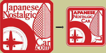
Series 2
The Series 2 sticker came out during a time of great change at JNC. Although we originally debuted as a website, our plan from the beginning was to eventually release a print magazine. One of our original goals was to elevate vintage Japanese cars to the same level as European classics or American muscle cars and to do that there needed to be something with more permanence than a mere website. So with the introduction of JNC Magazine we replaced the “.com” with another iconic symbol of nostalgics, the fender mirror. We also prettied up the design a bit and addressed some complaints about Series 1 being too large by shrinking it down 25%.
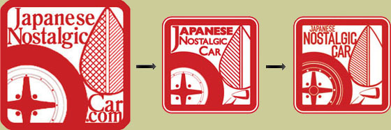
Series 3
Although it looks pretty similar to Series 2, if you hold them side by side you can see that not one thing has been left untouched. Many of the changes made were done for aesthetic reasons to tie in better with the redesigned logo. For instance, the tire in Series 2 was too tall. 75 series tires will not do, coming from a performance/aggressive standpoint. The wheel itself was made into a single, larger 3 piece barrel with a round center cap. The fender mirror needed to be more prominent especially next to the redesigned wheel. The leaf was redone and given more contrast with the additional diagonal lines. And finally, we redesigned the logo with a new typeface that is cleaner, bolder, and less old fashioned.
So there you have it, three generations of the JNC Stamp. With the release of Series 3 we started an ongoing contest. Order yours today and join in on the fun!


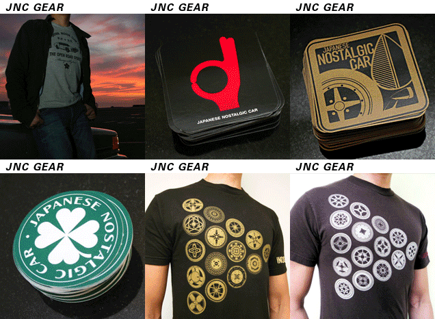

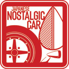
“we redesigned the logo with a new typeface that is cleaner, bolder, and less old fashioned”
less old fashioned? i thought that was the point??
wow.. looks pretty awesome
@Kent – Just because we’re talking about old cars doesn’t mean that the people who like them are old too. Same goes for the magazine’s design =P
Most of us, take the old and and make it new (restore & or modify).
I like it a lot! Goes great with the new JNC t-SHIRT!
I like the new look, but I prefer the series 1 the best. I am glad I bought a lot when I had the chance so I will never run out. I actually prefer the larger size. It definately makes a bigger statement and is more readable to passing cars on the road.
The first two were cool, but the third looks like like the best resolved design from a designer’s point of view. I especially love the added detail and subtle resizing of the rim and tire, and the extra care put into the size, placement, contrast and font – very professional. That said, the earlier two did have a kind of home-made charm reflective of the rough n ready early days of JNC.
Alan – that’s exactly what happened. The difference between 2 and 3 are not that noticeable (except fontwise) until you put them side by side. I really love it, and think we’ll be keeping it for a long, long time.
Love the look for the series 3… bought it and placed it on my car, which is unfortunately pretty modern.
Question, Dan. What happens if we decide to change it again (even though that is not foreseeable in the future)… does #4 become the head of an alien? 😛
We are fans of and welcome all types of cars here =)
I even saw a JNC sticker on someone’s daily driver C-Class Benz once!
In my opinion, our goal should not be to elevate Japanese Nostalgics to the level of Classic European or American Muscle Cars – that would suggest it is not equal to begin with. But in reality, the Japanese Nostalgic has a distinct flavor that is special upon itself. Look at the beautiful old school JDM wheels and the unique shapes of the cars, and you’ll see they have charm that is often overlooked. My personal goal is to provide design not just to elevate the Japanese Nostalgic Car, but to surpass all expectations of what these cars are by designing the magazine to the best of my ability. I feel MANY old Japanese cars are amazing pieces of sculpture far exceeding many European and American designs. We just have to look at them closer.
I think you guys should offer the current sticker in tow sizes, for those of us tha like the big size.
With all three designs you can easily figure out what JNC is about.
What about a Patch for jackets or racing suits ??
as long as the sticker looks good on my cars, it s all that matters to me.
besides the name japanese nostalgic gives it all away to the “normies” right?
keep it up guys!!!!
-rick
p.s
ill take one of them patches for my dickies jacket!!!!!
do it!! we want patches!!!
8)
Hmm, patches ey? We’ll look into it =D
Hey Dan, my company can maybe get you patches.
New stickers are nice!
You guys gotta come out with “makes” stickers..
Like ones for old Toyotas or Nissan Fairlady ones..
Just a suggestio..
I got my stickers ,they’re real nice…
THANKS!
@kingtoy – Turns out our sticker guy does patches as well. Thanks for the offer though!