
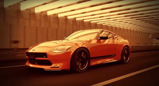
Cars always look different in motion than they do standing still. Nissan has released a video of the Z432-inspired Customized Proto with its new and improved nose, and it’s worth a look. Well, technically it’s more of a computer render, but it still gives you some more (and dynamic) angles than the one we saw on the Tokyo Auto Salon stage. This is what it would look like on the road.
The more we see it the more we like it. It looks great in motion, especially with the light dancing off of it from different angles. We can only imagine that it looks even better outside of the entirely tangerine-tinted world that it lives in. The throwback nose just looks so natural, so right.
If we had one nit to pick, it would be that the black stripes on the side end at the door cut line. Either extend it all the way to the rear tire or end it before the cut line (at the same angle as the line). Otherwise it looks like an oversight. Anyway, that’s one very small complaint. Overall, it’s a great looking car, and we hope Nissan is truly looking for a way to make this nose happen, as they say they’re doing.
Orange you glad Nissan is listening to the fans?

Its hard for me to look at this variant and not want one with these features instead of the stock version that they will be selling.
Make mine silver.
There is no reason this shouldn’t be the standard nose. It’s a huge improvement; a clearer link to past cars, and corrects one of the design’s only glaring deficiencies.
+1
Come on Nissan, quit floundering around and build something cool for a change.
Stop being a rental car manufacturer and start building real cars again.
Totally agree, It has been decades since Nissan got the looks of the Z right. Now that they have the formula they need to not screw it up by not producing it in this form.
Totally agree on the door stripe. Ending at the door line makes it look like they forgot to add the last piece of striping, or the wheel arch is covering it up. I get they were trying to add character to the side profile below the beltline but this just just draws my my eye to where the stripe ends which is the opposite of what they intended.
As for the stripe, at first glance I thought it should continue to the wheel opening. On my second viewing I noticed the Fairlady Z emblem at the end of the stripe and thought that adds a good ending to the stripe. So I am OK with it as is. It appears that a paint chip guard will need to be added to the front of the rear finder flair in clear or black as you use to see on wide body Porsche’s. Another thing I would pick on is the black roof and hatch. Color matching the body would look much better in my opinion.
pfft. why not throw on a chrome bumper and a set of slotted mag wheels and squint through nostagia-colored glasses…