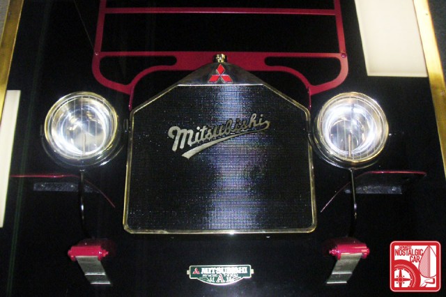
Japanese automakers love emblems, and we’re not just talking about those for the various marques. In Japan, each model often has its own as well, and these badges are highly desirable to those of us who want to JDM-ize our cars. Thus we ask:
What’s the best Japanese car emblem?
As a Toyotaku I’m tempted to pick the MR2 eagle or the Soarer gryphon, but actually I would have to agree with Matt and say Mitsubishi‘s reigns supreme. The three diamonds represent the family crest of the Iwasaki clan, after Mitsubishi founder Yataro Iwasaki, and their arrangement came from the Tosa, a samurai clan that Iwasaki was part of. So not only is it geometrically simple and easily recognizable, but it has history too. See the evolution here.
What say you, dear reader? As always, the most entertaining or inspiring comment by next Monday will receive a random toy. Click through to see the winner from last week’s question, “What was the greatest Mazda?”
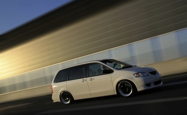
Like the rotaries that dominated IMSA, this week is was bert‘s epic poem (sung to the tune of Sir Mix-a-Lot’s “Baby Got Back”) that stayed ahead of the competition.
Ode To A Minivan
Oh 2000 MPV you are sublime
I remember well the, the day I made you mine
At a discounted rate, you fell out of the sky
All the while I wondered why
I would buy a minivan
But you stole my heart, with your wide alloy wheels
Your comfy interior, and your sporty feel
For many years you have hauled our stuff
Even tho we’ve been quite rough
From screaming kids and trips to the mall
Grocery runs and soccer balls
Through rain and snow, and slimy puke
Midnight runs to the emergency room
Zoom, zoom, zoom!
Rockin out to the childrens tunes
“Hey diddle diddle, the cat and the fiddle, the cow jumped over the moon!”
But now your knees are week, and your headlights are sagging
Your joints, they creak and your bumpers are dragging
Relegated to work duty
Carry all my equipment in that big ol booty!
On your maintenance money we lose
$600 dollars for a new pair of shoes!
180,000 miles, it won’t be long
Till your exhaust sings it’s final song
In your place of honor in my backyard left to die
To that great car heaven in the sky
An end to this ode, I think it’s time
Will I win a prize for my rhyme?
Here’s to the greatest Mazda of all time!
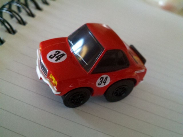
Omedetou! Your prize from the JNC gashapon is a Choro-Q Nostalgic Sports Car II Collection Mazda RX-3.
[Image: ki-ck]


This is incredible! Not only did I win, but I just proved my wife wrong! Know she owes me! Oh the power!!
As the former owner of an 86 MR2, I can tell you, nothing confused me more than seeing that screaming chicken emblem on the hood! I was so confused as to why Toyota would use something so close to a Pontiac emblem. I polished that thing three times a week!
proving your wife wrong will also result in polishing one’s chicken thrice a week 🙂
hahahaha, well put!
The 1935 Datsun Type 14 rabbit mascot was an item of beauty created by body designer Ryuichi Tomiya. http://www.nissan-global.com/GCC/Japan/History/gallery/img/dat-3.gif
Just Toyota has so many good emblems that I can’t even pick a favorite 🙁
The Toyota Century Phoenix Emblem. http://img.ezinemark.com/imagemanager2/files/30002496/2010/12/2010-12-06-15-55-04-7-the-ornament-eagle-of-toyota-century.jpeg
How do you top a car that is not expected of a “Beige” car manufacturer, is often compared to coachbuilders like Maybach and Rolls-Royce, has outlasted it’s competition (NIssan President, Mitsubishi Debonair/Proudia/Dignity), and subtly honors it’s founder? Put the Phoenix on it.
One of the most iconic would have to be the Nissan GTR badge.
The silver and red ‘GT-R’ began in 1969, and 43 years later, can easily be identified to the original.
Through 6 generations of cars and motorsport history, I think this badge is here to stay quite a few more.
KPGC10 1969:
http://justjap.com/store/images/P/62318-R1125.jpg
R35 GTR 1012:
http://revivalsportscars.com/wp-content/uploads/2011/05/Nissan-GTR-2012-R35-Black-Edition-Grill-Badge-1024×681.jpg
I always loved Mazda’s simple rotary logo. Graphic, symmetrical, scalable and simple, yet unique and identifiable. Any logo that takes an actual element of the brand’s product and turns it into an icon already tends toward greatness, but it’s even stronger when the design is also a near-literal depiction of its most significant attribute.
Compare it to the awkward boxer logo on a new Scion FR-S and you can understand why Subaru looked to the stars instead of under their own hood for their own lovely Pleiades logo.
Perhaps the best testament to how right the Mazda logo was can be seen in how many times they searched for a suitable replacement logo, once they chose not to pin their image on their rotary history… the lonely stylized type that stayed around through the 1990s, the “pen nib” of 1993, and today’s mustachio-like wings in a box just don’t have the power of the iconic little rotor.
@cesariojpn: That is quite the chicken!
I have a soft spot for the three-stars (flowers, as it turns out) -over-C Corolla emblem, either the rounded E20/E30 or squared-off E70 version.
http://www.celica-supra-team.ch/report/images/CorollaLogo.jpg
http://cdn-u.kaskus.co.id/35/y3qu0noj.jpg
I love love LOVE the Efini RX-7 emblem. Somehow Mazda managed to combine the alpha-numeric ‘RX-7’ with the general shape of the wankel rotor and made a cohesive design out of it.
http://www.cartype.com/pics/89/small/mazda_efini_emblem.jpg
Ok I’m lying, it’s not really cohesive. It’s more like a jumble of incoherent lines, like somebody was having fun with the pen tool on adobe illustrator. Which is not entirely impossible actually. Anyways, it looks sexy, and that’s all that matters. In fact…I think I might use one on my own RX-7….
Toyota has definitely produced some of the most identifiable, model specific badges.The one that I like the best, and not just because I’m biased, is the Celica dragon. It has been used with many emblem variations, in different colors and locations on the Celica and Celica Supra. The logo looks great on a t-shirt, center cap, 3D emblem, tattoo, embroidery, and it’s now identifiable as a symbol of hardcore Toyota heritage. And besides, what creature tops dragon? A reincarnating chicken or flying rabbit? Triangle shaped whirly thing? No, dragons are the real-mythological deal!
The Celica dragon is the best…I own a 1980 Toyota Celica and everyone asks about the logo…Do you remember Celica stands for celestial…..
how can you go wrong with this emblem?
http://art8.photozou.jp/pub/487/197487/photo/17657223_big.v1349058043.jpg
Old school Toyoda AA hood emblem. It’s gorgeous, says Toyoda in Kanji, and looks like a million dollars. Too bad Toyota’s fortune teller told him to go with 8 strokes.
Again with Toyota, but this time… the Starlet. Not long ago, with a group of others, I helped a friend toss a 4ag into her Starlet. A pretty simple car, and not much fanfare. Anyways, Toyota usually puts the model emblem on the hood, and in the center of the steering wheel, right? Nope, the Starlet was too much of a bargain I reckon, and therefore the idea was kibosh’d.
So just the steering wheel then; for only the driver and their passengers to enjoy; the coolest looking emblem the big T created, an art deco stag (a six point no less), with a star between it’s antlers. Ok, so this might warrant a coolstorybro.jpg but I still contest it’s rad, and at least gets you through the day when you have a 4k under the hood.