
![]()
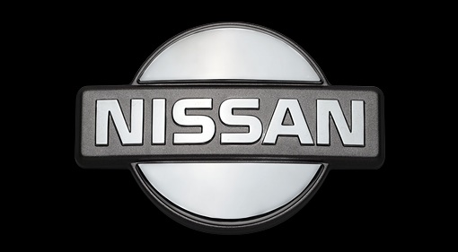
Nissan has a new logo, debuting on the electric Ariya Crossover unveiled in Yokohama this week. Usually we have to be dragged kicking and screaming toward any change like this, but in this case, we have to say, the new logo doesn’t look half bad. It might even be an improvement. Plus, as we are about to show you, there’s been quite a few changes to Nissan’s logo over the company’s 80-plus years in business, so it’s not like the chrome hamburger is a sacred cow.
![]()
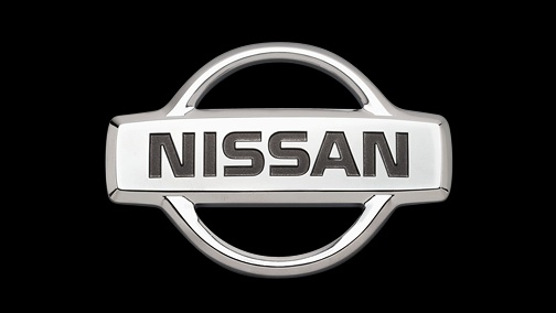
Before we go any further, though, take a look at the new logo. It dispenses with the horizontal bar crossing the circle, simplifying the design. Notably, it does away with the 3D ring and rectangle look. This follows a wider industry trend of flat logos pioneered by Apple, but in theory it should make the logo more versatile. Before the circle was made chrome, it was red to represent Japan and evoke the Japanese flag. The “Ni” in “Nissan” is the same as the “Ni” in “Nihon” and literally means “sun.” “Nissan” literally means “Japan Industries.” Now, the ring and rectangle are still denoted, but with way fewer elements. The text has been thinned and the font slightly altered as well.

Now, let’s look at some logos from Nissan’s history. This isn’t a comprehensive list, but the images were taken from Nissan’s own Yokohama Gallery display and a timeline they had on their website years ago (which seems to no longer exist). Thus, these are the logos Nissan itself deems significant. So without further ado:

1935: Datsun Type 14 hood ornament. Note the leaping rabbit form, as the Japanese pronunciation of “Dat” is “datto” which can also mean “coursing hare.”
1935: model unknown

1959: Nissan 680

1960: Nissan Cedric

1961: Datsun 320

1963: Datsun Bluebird 410
1965: model unknown

1966: Datsun Bluebird 411

1967: Nissan Skyline S57D

1967: Datsun Bluebird 411 (export)

1970: Datsun Cherry 100A E10

1972: Datsun 240K C110
1972: model unknown

1976: corporate

1983: Nissan Skyline R30

1984: corporate
1988: Nissan Bluebird T12

1989: Nissan Skyline R32

1990: Infiniti G20 P10

1990: Nissan Primera P10
1992: model unknown

1993: Nissan Sentra B13

2001: Nissan Cima F50

2009: Infiniti G37

Here’s the first official use of the new logo, on the Ariya’s grille. As you can see, you can still put it on top of a circle and rectangle to help ease the transition. Eventually, it will probably appear without the shape to support it. According to a source at Nissan, the old logo will stay around for another year or so, with the new logo taking its place as models as they’re introduced or refreshed.

On the rear of the Ariya, the new font allows for a more elegant text-0nly logo. The old blocky font just wouldn’t have worked here. It would’ve looked too old-fashioned. True, they could have continued to use the hamburger, but the word “Nissan” wouldn’t have been visible unless it was huge, and it was already pushing the limits of the real estate on the trunklid. Now, the branding from the rear is much stronger.
Here’s a couple of more examples that show the logo’s versatility. The previous 3D logo could only be chrome, but the new one can be applied to any number of colors and textures while still remaining recognizable. On the Ariya, it looks like it will light up. During the day, it’ll look like the old logo, at night, it’ll look like the new one.
![]()
In that sense, it’s kind of cool. When Toyota introduced its three-oval logo in 1989, it was such a departure from the old Helvetica “TOYOTA” that it seemed incongruous. Mazda has also had a number of logos over the years that don’t look anything like each other, even if they each had meaning. Here, at least Nissan maintains some continuity to a logo that can be traced back to the 1930s. What do you think of Nissan’s new logo?

Hmmmm… I would have preferred that they revisit the “1984 Corporate” logo, with a little update/modernization/clean up with the “red sun”, since it is, after all, NIssan. The new logo looks like an eclipse of the sun, as in, they’re being eclipsed by everyone else…
Is there any truth behind the “corporate mythology” that Nissan is an acronym of two Japanese words Nippon Sangyo (Japan Industries) and that the first two or three letters of both words were selected when they were listed on the Tokyo Stock Exchange back in the 30’s?
The company has had some of the more interesting styling in recent years, and the logo shows that talent isn’t gone. They’ve got a long way to go on recovery, but hell, a new suit can’t hurt the mentality change necessary.
The 1984 Red and Blue will always be my favorite, but I think Nissan needs a refresh and I like the new logo. I’m hoping the upcoming lineup will reinvigorate Nissan as a company and hopefully the new Z car will perform well in both sales and actual performance.
Not a fan of the sci-fi 2001 Space Odyssey look. I like the old school look although I admit to being a fan of Saul Bass logos & artwork. I just think the minimalism has become overdone. I agree with Steve above; the sun and bar logo is what is engrained in me as “Nissan” or “Datsun”.
I quite like it. Feels familiar but fresh.
Tbh I don’t think there was much to lose. I love Nissans and Datsuns, but I don’t think the Nissan logo has ever been that great. I’ve only ever seen new ones with the silver versions and it always felt stiff and corporate to me. Which always felt underwhelming because some of the model logos have been interesting.
I reckon younger fans will embrace the new one. First sense I’ve gotten of life and vitality from Nissan in a long time.
I was thinking about what it reminds me of and it twigged. The circle segments remind me of the Omega symbol. Hope it’s not supposed to mean that Nissan knows this logo will be on the last cars it makes…
Logos and badges are not necessarily the same thing. A badge on a car may not represent the official logo, e.g. Toyota has had many badges, but until the three oval logo, it was a simple TOYOTA, with トヨタ used as a secondary mark.
And it was Microsoft, NOT Apple who pioneered the flat logo, first appearing on Windows Phones long before they showed up on iPhones.
For many decades Chevrolet had differing logos in print and on the cars themselves. Starting in the late ’30s the word Chevrolet only appeared within the bowtie in the former case, never the latter, and the colors varied more on the cars themselves – they experimented with different colors for different classes of vehicle before settling on always yellow-gold, twice – while it remained blue in print until quite recently.
So, Nissan and Toyota aren’t alone in their inconsistency.
That tenth item is the fender and trunk emblem for export versions of the 411 sedan. Domestic versions had a “Bluebird” insignia. The PL411 trunk emblem is this item. The RL411 had aa different emblem. “Unknown” solved!
Thank you, Mike! I will update the post.
eleventh badge is the 411 [and maybe 410] grill emblem
Thirteenth is unknown to me, it is definitely not an export [at least to North America] badge
I think that the G37 front would look far more classy wit the 1960 Nissan Cedric running writing logo. The front is kind of gaudy enough without the big badge there.