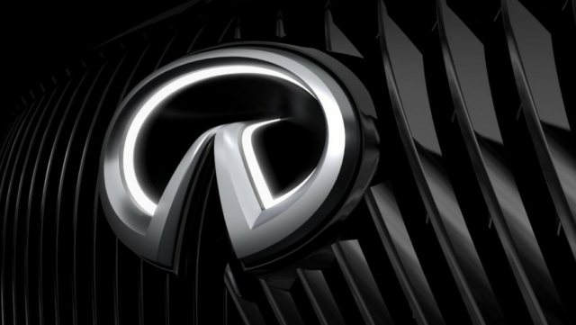
Unless a clapped-out G35 is about to smack you in the ribs at a takeover, you probably don’t give Infiniti much thought these days. You might even be surprised to learn that the Infiniti logo was recently updated, along with a new signature sound and signature smell for the brand. It’s the fourth version of the logo since the marque’s launch in 1989, and while our curmudgeonly asses are pretty resistant to change for change’s sake, we think this logo actually makes sense.
The first three versions of the Infiniti mark are all rather similar. The “INFINITI” wordmark typeface underwent some slight changes for legibility, and the lines of the oval was fattened up, then thinned back out but generally kept the same shape. It’s supposed to represent a road stretching to infinity (har har) but was derisively called the “Zorro mask” when it debuted initially.
The latest iteration changes, for the first time, the shape of the road. Instead of the two lines converging on a point, they keep a tiny gap between them. This makes a lot more sense as the lines are supposed to represent the edges of the road. The gap maintains the illusion that there’s a road between those edges and makes it look less like a mountain peak.
Not only that, but the new logo has a three-dimensional component, where the center of the logo dives inward into the grille. As much as we liked the Q45 belt buckle, the old oval looked rather flat, both literally and figuratively. The new shape adds some depth and dynamism to the logo, like an old school art deco hood ornament of a charging animal or winged woman. We’ve seen a version of this idea on some Infiniti concept cars, and it looks good.
Additionally, Infiniti is leaning into its Japanese origins with a new dealership look. New architecture with a pagoda-esque roof and plenty of glass will perhaps recapture some of the glamour of auto showrooms from the 60s. Essential to the new look is the Japanese concept of ma. As Infiniti explains it, “Unlike the Western construct of minimalism, Ma embraces empty space in an additive capacity.” In other words, it uses the space between as an necessary part of the design, as in a rock garden.
But that’s not all. Dealerships will be infused with Infiniti’s new signature scent, which combines hinoki (Japanese cypress), sugi (Japanese cedar) and yuzu (Japanese citrus). Infiniti says it was “crafted by a master scent designer” if you can believe there is such a profession. Finally, the brand’s signature sound will now incorporate taiko drums and — as perhaps a throwback to the original Infiniti commercials that confused the public by showing only scenes of nature and no car — furin wind chimes.
While all this is fine and probably good for the brand it won’t amount to a hill of beans unless some excitement is injected in to the lineup. Phrases from the logo introduction such as “steadfast focus on the future” are downright comical considering how long most of Infiniti’s lineup have been around. Aside from a couple of newish crossovers, there’s been no movement on the stuff that was once exciting — the Q50 sedan and Q60 coupe, the Q70 luxury sedan, or the Patrol-based QX80 SUV. Oh, and that Q45 they keep showing in the video is pretty cool. Hopefully Infiniti’s creative minds are working just as hard on some new product as they are on the branding.


While I can understand the redesign of the logo, how does the scent come over … through the exhaust pipe? Can you see it now, looking for your car in a parking lot by sniffing the air ….
It’s all about “That New Car Smell”
Interesting this occurred so soon after your QOTW regarding logos. As Ben noted this is all wonderful as long as the product matches the talk.
Infiniti used to be one of my favorite automotive brands. In the 2000s they had an awesome lineup: Q45, M35 / 45, G35, QX56, FX 35 / 45. I think I had mentioned, in previous posts, that I had yearned (and still do) for a 2005 / 6 G35 sedan 6MT, but instead bought my Miata. It’s a shame the brand has lost all identity. And I agree there’s absolutely nothing innovative coming from them, save the variable compression ratio engine (but where is that engine residing in??).
I was just overseas in the Middle East, and saw a commercial for one of their SUVs. The theme was focused on all the technology the SUV contained, but the 30-second script showed Apple CarPlay and six (6) USB outlets as the features. NOTHING else.
Company had its peak, not it’s at it’s lowest.
I think that the Ghon era might have been financially necessary to save Nissan, but in the process it nearly killed the patient emotionally. Some of their most recent stuff seems like the company is having some stirrings of self-belief, and it would be really nice if that could continue, and they used Infiniti as their best foot forward. It will take a lot of hard work and time before they can shake off that G35 legacy. Which wasn’t even their fault. It was an excellent car, but everything that came after it left the showroom has hurt them badly.
The ‘genius’ that decided to name every thing “Q” just didn’t get it.
I feel I need to go to a poilce auction and snag up a G35/37. I’m almost certain it will need work, but hopefully gotten at a relatively good price.
As an Infiniti person (I have 3 M30s), I like the logo update. Back in 2020, before the pandemic, I checked out Nissan Gallery right by Yokohama station. They had this cool display of the Nissan/Datsun/Infiniti logos.
https://www.f31club.com/wp-content/uploads/2020/03/20200127_104935.jpg